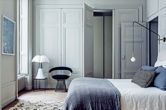
Hold your breaths ladies and gentleman! The supreme agency for colours is back yet again with the Top 10 colours for Spring 2017.
Be ready to add a dash of Primrose Yellow, a spoonful of the resplendent Lapis Blue and a sprinkle of the earthily relaxing Kale to your creative corners, homes, office spaces and closets.
Pantone has released a colour roster that is full of energetic and relaxing hues, which blend together in a perfect harmony.
One of the things that we saw this year, was a renewed sense of imagination in which colour was appearing in context that was different than the traditional.
-Leatrice Eiseman, Executive Director of the Pantone Colour Institute
The colours evoke a sense of emotion and feeling and are reminiscent of the hues that surround us in nature.
We present to you the hues in the Pantone Spring 2017 colour roster so that you are one step ahead of everybody in the upcoming season with the trendiest styles.
1. Niagara
A classic denim-like blue, it gives out a dependable vibe and calls out to the easy-going and laidback souls. It leads the Pantone Fashion Colour report as the most prevalent colour for Spring 2017.
Image source: Vogue
2. Primrose Yellow
A colour which adds a spurt of warmth and vitality, Primrose Yellow is synonymous to the bright Spring season. This ebullient shade adds a dose of freshness and is a sure way to channel cheery and bubbly feelings to a space.
Image source: Vogue
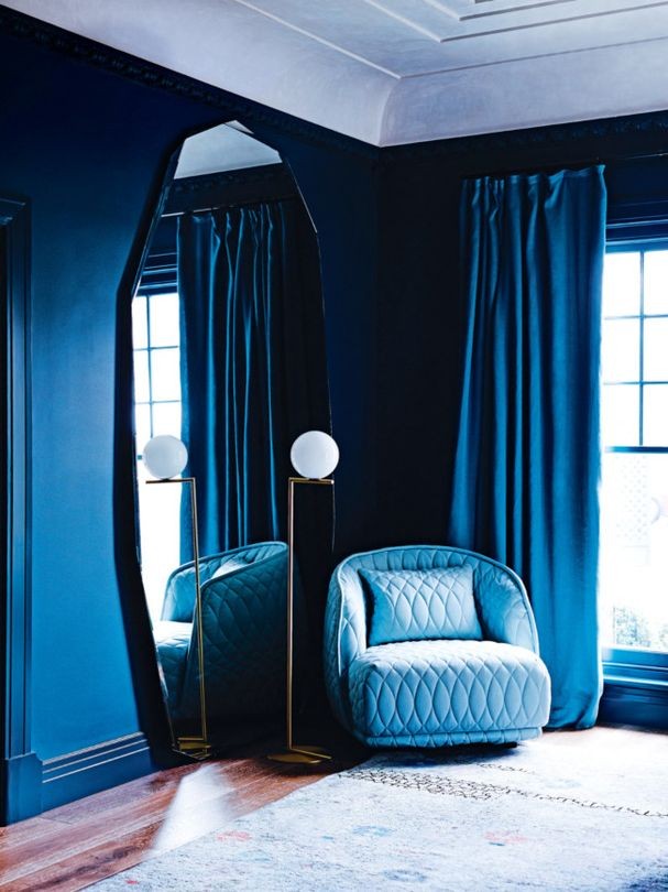
3. Lapis Blue
In Eiseman’s words, “Blues are anchoring colours…and give us reason to calm down a bit.” Lapis Blue is a bold and radiant colour. This intense blue sparkles from within and has innate characteristics of strength and bursting energy.
Image source: Vogue
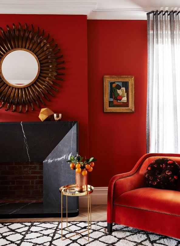
4. Flame
A colour full of sizzling heat and playfulness, this red-based orange is gregarious and fun loving. Flamboyant and vivacious, this wonderfully theatrical shade adds fiery heat to the spring 2017 palette.
Image source: Vogue
5. Island Paradise
Island Paradise is a cool blue green shade that speaks to us on a deeper level and takes us on an airy journey to shake us out of our torpid states. This aqua is emblematic of tropical settings and is a refreshing addition to the colour roster.
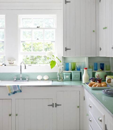 Image source: Today
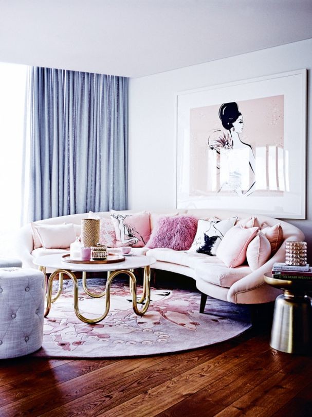
6. Pale Dogwood
A peaceful hue, Pale Dogwood adds a soft touch to the eclectic Spring colours. Similar to Rose Quartz, the colour arouses a feeling of innocence and purity through its accommodating nature. The subtle pink adds a happy glow and sets a mood of quiet introspection and tranquillity.
Image source: Vogue
7. Greenery
Diverging from the tranquil path, Greenery brings forth a burst of refreshing energy. This tangy yellow-green engenders adventures, discoveries and new innovations. Corresponding directly to the lush green in the nature, this colour encourages one to go outdoors and connect with one’s surroundings.
Image source: Today
8. Pink Yarrow
An eye-popping shade, Pink Yarrow is all about high spirits, unapologetic attention and soaring temptations. This whimsical colour rejuvenates the soul and crackles the air with its lively and tempestuous nature.
Image source: Vogue
9. Kale
Illustrative of the great outdoors, Kale’s healthy and comforting character evokes a desire of forming deep connections with our roots. This fertile, natural green adds an earthy tone to the otherwise bold and vibrant colour palette of this season. A new breakaway, Kale has us swooning over it with its muted and sophisticated nature.
Image source: Vogue
10. Hazelnut
Rounding out the spring 2017 colours is Hazelnut, a key neutral for spring. Pantone Colour Institute’s executive director Leatrice Eiseman describes this hue as “a quintessential neutral with a warm undertone.” Hazelnut’s straight-forwardness and unobtrusive character lends it the perfect attributes of being a transitional colour. With its inherent warmth and undeniable lightness, it effortlessly connects the seasons together.
Image source: Vogue
With the Pantone Spring 2017 palette, you’re all set for a trendy season. Get artsy this coming Spring, folks!


