Tracing the roots of typography can be a daunting task, but one fact that everyone will agree on is that typography has evolved by leaps and bounds with the advent of the digital era. Developed at first for printing purposes, typography is usually defined as the ‘the art, craft or process of composing type and printing from it’, but as is the problem with all definitions, the actual activity is much more flexible and far-reaching.
Fascinated with the concept of typography, we at TYS have compiled a list of master manipulators of the written word for your pleasure!
1. Craig Ward
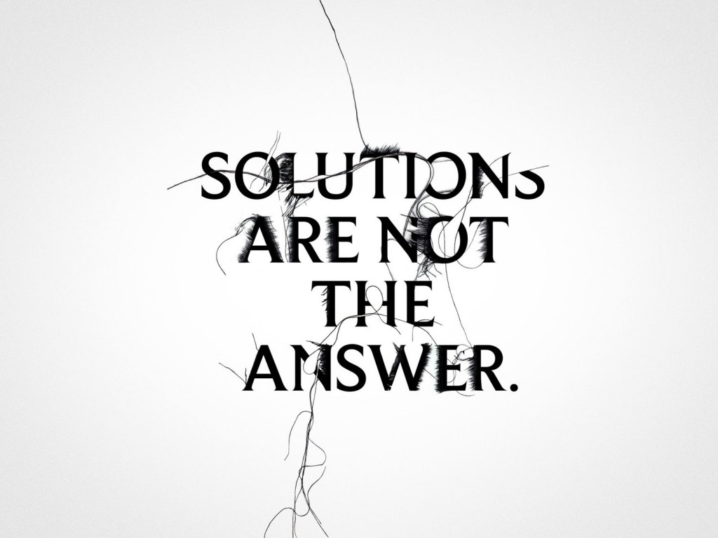
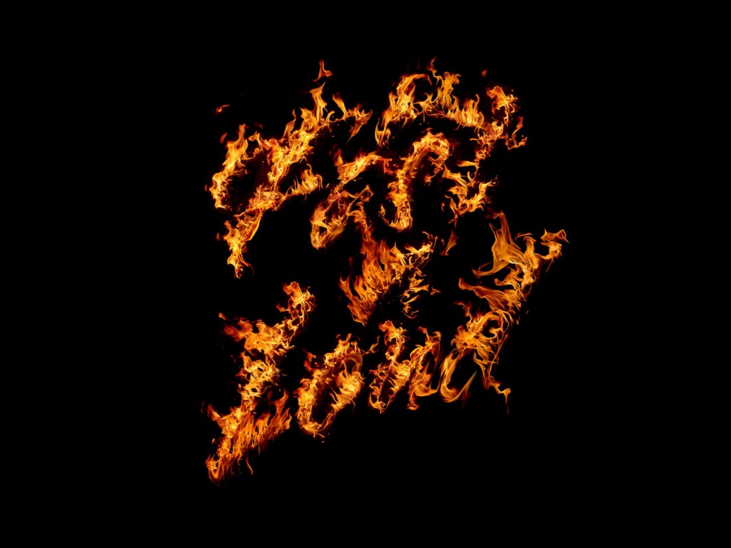
Based in New York City, British born designer Craig Ward is quite well-known among typography enthusiasts and he should be, given that his past clients include Nike, The New York Times, Wired, Gillette, Calvin Klein and numerous others. Fascinated by the concept of “word as image”, Craig is always looking to express more meaning through headlines and texts.
His compositions usually involve a limited palette of colour, but he uses them quite meritoriously by combining typography with programming and graphic designing. What makes his pieces so effective in making an imprint on the viewers is the fact that he often creates pieces that reflect an issue prevalent in our society, politics or in the news. As such by using typography as a metaphor, he allows viewers to develop their own interpretations of the image.
Known for pushing the limits of typography, Craig says legibility is overrated, declaring,
I’m really over legibility. People place too much emphasis on it. It’s a client word, and is often confused with readability. Legibility and readability are two different things, and I think it’s all too easy to be legible. You should make people want to read something, as opposed to just laying it out there.
In 2012, Craig also released a book titles ‘Popular Lies About Graphic Design’, in which he aims to – as the title suggests – debunk myths about graphic design, while also discussing the lessons he’s learned throughout his career.
IMAGE COURTESY – CRAIG WARD
2. Alex Trochut
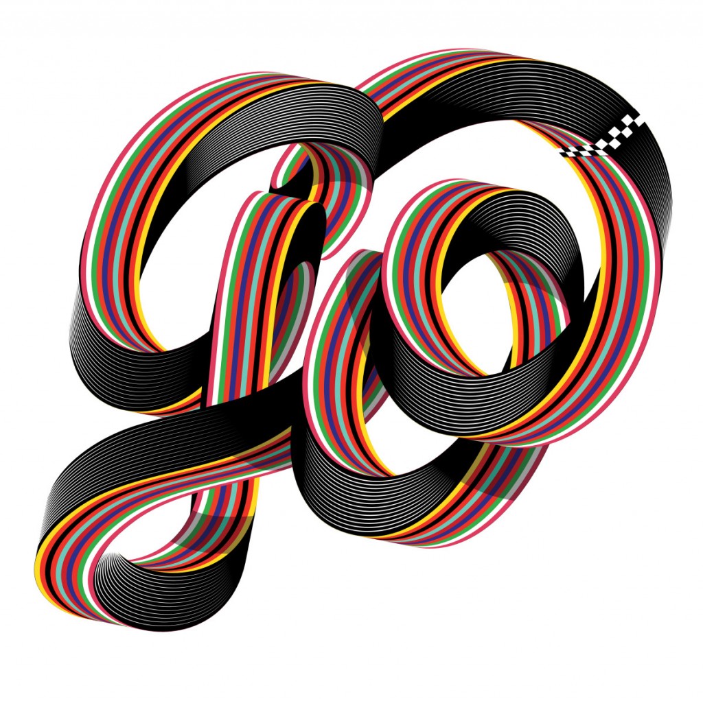
Another New York City resident, Alex Trochut was born in Barcelona, Spain where he completed his studies at the ELISAVA Escola Superior de Disseny and also went on to finish an Erasmus in Berlin, Germany. An extremely talented designer, Alex’s client list boasts of names like Pepsi, Coca-Cola, Adidas, The Rolling Stones, etc. and he is especially known for creating an eclectic mix of genres and styles, taking inspiration from fashion, music and pop culture.
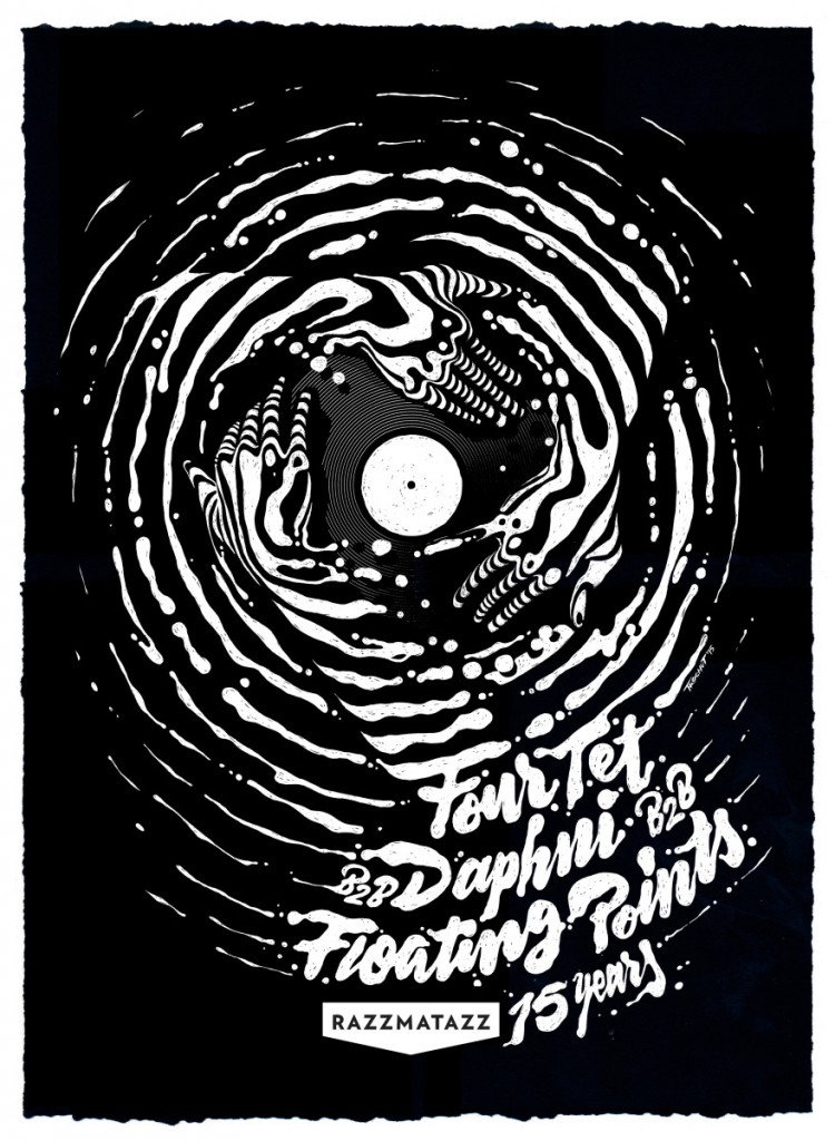
Typography, according to Alex, works on two hierarchical levels. First is the image of the word we see and second is the reading of it. While designing, he principally focuses on the potential of language as a visual medium, with an aim to unite text and image into one unified expression, so much so that “seeing and reading become the same action”.
Explaining his work – which often merges together typography, illustration and lettering – he explains,
I guess it’s because I love type, and I also love illustration, so the work is just a reflection of this double and equal love. I like to feel close to graphic design but in an expressive way of seeing it — so doing expressive typography is where I find my place, and can still feel like a graphic designer.
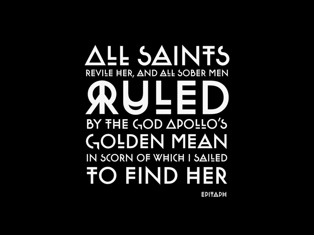
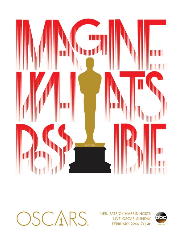
Alex also designed a poster on the theme, ‘Imagine What’s Possible’ for the 2015 Oscars. About his poster, he says,
Letter forms are a way of expressing non-verbal communication [and] when done thoughtfully, a visual communication similar to picking the right dress for the Oscar red carpet. For this particular project, I selected influences from Art Deco and Avant Garde found on the red carpet.
IMAGE COURTESY – ALEX TROCHUT
3. Nicole Dextras
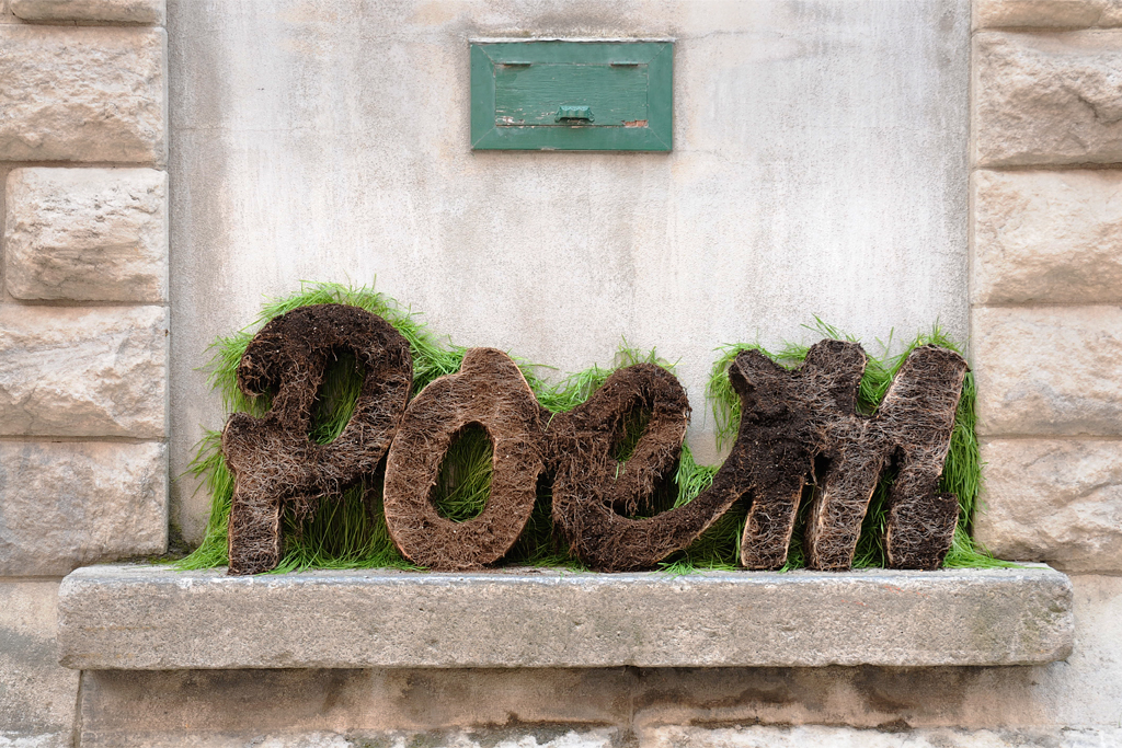
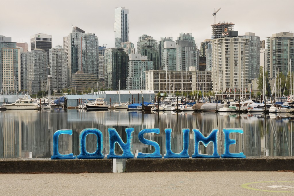
Canadian artist Nicole Dextras is popularly called an environmental multimedia artist for her use of natural elements in her artworks, which often provide a commentary on our world and raise necessary questions about human actions. From fashioning life-size clothes out of leaves and flowers, to creating words out of ice and grass, Nicole has carved a niche for herself in the design world.
Nicole’s take on typography – which she calls ‘Social Typography’ – sets her apart from her contemporaries, while reaffirming her environmental commitment at the same time. Her creations are divided into two breathtaking series – ‘Ice Typography’ and ‘Green Words’.
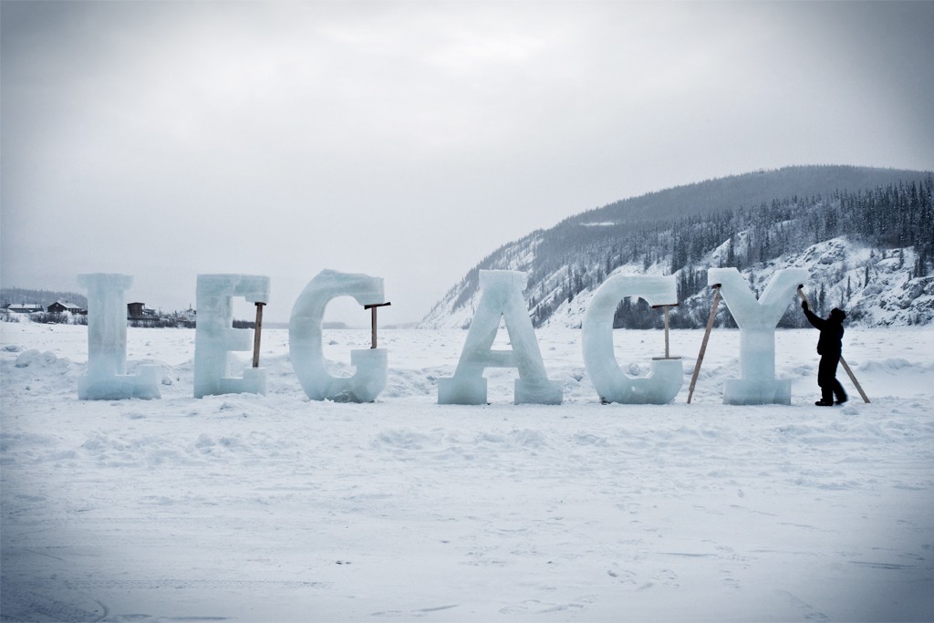
‘Ice Typography’ involves three-dimensional words carved out of ice placed outdoors, ranging from as small as 18 inches in height to a whopping 8 feet. Nicole pours water into moulds – sometimes even coloured for effect – allowing it to freeze and then assembles them to form words, placed as frozen statements that inform its landscape. The life of these artworks is always determined by the temperature, regardless of where they’re placed – whether in heart of Toronto or in the comparatively colder Northern Canada. Nicole states,
This phase of transition becomes symbolic of the interconnectedness of language and culture to the land as they are affected by time and by a constant shifting and transforming nature.
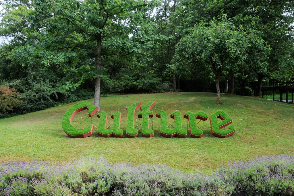
During her residency at the VanDusen Botanival Gardens, Nicole created a series of installations titled ‘Green Words’. Each six foot high installation consists on wooden forms, which were planted with grass seeds and allowed to grow wild, in contrast to the manicured lawns of the VanDusen Gardens, drawing attention to the dualism of nature and culture.
IMAGE COURTESY – NICOLE DEXTRAS
4. Ari Weinkle
Combining typography with wriggly animal appendages, Boston native Ari Weinkle created quite the stir when he unveiled his project ‘Feelers’ in 2015. On his website, Ari defines his work as ‘mostly experimental, often digital, and usually weird’ and his latest project certainly lives up to the claim and beyond!
The typeface is based on the movement of animal appendages which replaces swashes with tentacular flicks and stems with slug-like bodies. When viewed as static, the alphabet appears almost dignified but it’s when you view the animated version that the real art is revealed. The animated alphabets appear to be live specimens flailing about as if viewed through a microscope.
Explaining how he created the project, Ari says,
Feelers is a typographic experiment based on the movement on animal appendages. It was created as a personal project to expand my technical abilities. I was inspired by the movement of small organisms and deep sea creatures. To create the artwork, I used Illustrator, Cinema 4D, Photoshop, and After Effects… in that order.
‘Feelers’ showcases Ari’s ability to combine the organic movements of life with the strict requirements of typeface. But despite the unique nature of his project, Ari found his inspiration in a rather classic source – old brush lettering typeface. Ari states,
I noticed that the letters could be treated like muscular joints.
A perfect blend of creativity and the bizarre, ‘Feelers’ can viewed on Ari’s Tumble page.
IMAGE COURTESY – ARI WEINKLE
No one can dispute the power of the written word, but typography certainly lends even greater strength to it. An art that lives and grows, as languages do, it also shows us the world as it is and as it should be.

