An up and coming graphic designer, Pragun Agarwal’s interests tend towards typography and calligraphy, which is evident from his Behance and Instagram. His work has been awarded in the illustration category at the Kyoorius Student Awards, 2014. In conversation with The Yellow Sparrow, Pragun discusses his graphic design, typography and calligraphy work.
After graduating from the National Institute of Design, Ahmedabad, Pragun has gone on to work at Codesign in Gurgaon. Having worked there for the past two years, exploring the wide scope of work that graphic design entails, has led him to develop a very keen interest in calligraphy and hand-lettering, which he pursues on his own time post his full-time job.
“Over the years, I have tried to understand, in depth, the different facets visual communication has to offer, as well as learn and absorb from my faculty, seniors and batch mates,” Pragun tells TYS. “In addition, working with the studio Codesign for the past 2 years, has helped me understand and appreciate the world of branding as well.” He mentions the food-type series (Increase Your Appe-Type) as one of his favourites, with an “interesting context and brief.”
Going into detail about his influences and mentors, Pragun talks about the work of Seb Lester and Andrej Job as always having been inspirational to him. While growing up, he was always inclined towards the field of creativity—but did not know specifically what he would end up doing. His family has always been more than supportive of his decision to be a part of the creative industry, and a lot of seniors, faculty and peers have been a continuous inspiration to him with their work at NID.
Pragun’s Behance page is full of beautiful examples of his lettering work—just look at his most recent “caramel” (from the Increase your Appe-Type series) and see if your mouth doesn’t water! The most interesting feature of his work, of course, is how unique each piece is. Every one of them will have intrinsically different lettering and an overall different feel to them. That is, essentially, what makes his work stand out from the crowd.
“I feel my work is all about trying new mediums and techniques, and I would continue to explore more ways of expressing different styles and materials in the future.”
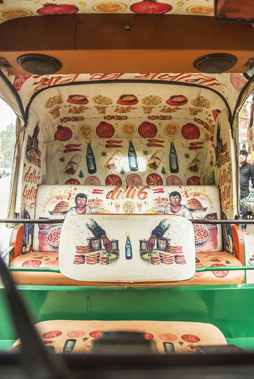
Talking about his upcoming projects, Pragun mentions Taxi Fabric, the Mumbai-based organisation focused on turning taxi seat covers into canvases and creating a great outlet for their designers to channel their talent and enhance the everyday travel experience of thousands of locals, using the platform of taxis to make contemporary design available to everyone. Here’s a sneak peek at the project, Delhi’s Belly, from Taxi Fabric’s Instagram!
“The artwork for Taxi Fabric has been deeply inspired by my mother’s childhood memories,” says Pragun. “Having been born and brought up amongst all the diverse flavors and hustle bustle of Chandni Chowk, she has always had a lot of stories to tell me from when she was my age. After visiting these streets myself, I realised that the place was not just about the food, but was an overall enlivening experience. I wanted to have a very honest, hands on visual approach to this very experience, and hence chose water colors as my medium. The medium helped me express more effectively, and added a very raw character to my storyline.”
Alongside his pure, raw talent, you can see a true love for his work in Pragun, something that is refreshingly unique and is definitely taking him places.


