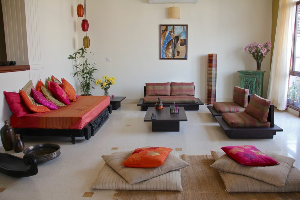
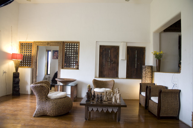
The Oxford dictionary defines Minimalism as ‘deliberate lack of decoration or adornment in style or design‘. The definition sounds quite mundane, but in reality, this ‘less is more’ philosophy is everybody’s newfound love.
Clean lines, subtle or no textures, sober colours and little to no statement pieces define minimal decor. But in the Indian context, minimalism takes a different form.
The Indian aesthetic is flooded with vivid colours and prints and textures that echo nature’s beauty. All of this is put together in such a beautiful manner that anyone who looks at a creation is left mesmerised. We have all grown up surrounded by it all our lives and it is almost impossible to take that sensibility out of our souls.
Wherever Indian culture is portrayed, it is always with these colours and festivals that make us so prominent on the world map.
Thus, even the minimalism that we follow has a touch of the same. Instead of an amalgamation of all these elements, the Minimalist Indian Decor mantra is to use any one or only a few of these elements very subtly.
Textures
We are the land known for its extensive variety of weaving and embroidery. Each area has its own unique variety and each is as beautiful as the other. They all create amazing textures which can easily be incorporated into decor, whether as an accent or a theme.
This living room uses jute rope’ texture as a major decor idea in a very minimalist way. The earthy colours bind the room together while the window pane and doorframe add a very obvious Indian element. Noteworthy is the table which also resonates with the same Indian aesthetic.
From Phulkari to Katha to Zardozi, India has a lot to offer in terms of surface ornamentation. With more exposure to the craftsmen and establishments like Good Earth and Fabindia coming into play, the designs are getting more contemporary and blend in better with our minimal sensibilities. With upholstery like this, one can bring in a dash of colour, the Indian way, without breaking the minimalist approach.
Artefacts
We are a land full of arts and crafts. And the world is adopting these so why shouldn’t we? They not only bring a beautifully detailed element into play but also add a certain richness to the otherwise orthodox minimalist dream.
The ornate and heavy door with the sculpture and lantern exude Indian sensibilities, yet the colours are such that they do not look over the top and remain minimalist. Also, the very subtle texture on the wall adds a very subtle mood to the overall look and feel of the room.
These Pipli Lanterns from Odisha bring a certain charm to this corner. Artefacts and pieces like these can bring out almost any space in your house or even your office.
In this living room, all the pieces are put together with a classic minimalist approach. But the mirror takes the pride of place and adds the Indian touch. Also, the prints on the cushion are very Indian in their motifs and add to the element.
The most obvious choice to use as an Indian element is our bright colours. But for minimalists, just a dash of it should be enough to fit into the theme. Minimalism says less is more, but that surely does not mean that we use lesser and lesser of Indian aesthetics. With these tips and tricks, one can subtly or boldly incorporate both Minimalism and our love for India inspired visuals.


