What’s the first image that comes to mind when someone says ‘apple’? A silver-grey icon that’s missing a chunk from the right or a juicy, red fruit that Snow White couldn’t resist? Most people will agree with me when I say that it’s often the former. That’s the power of a good business logo—it can make a man-made concept seem more natural than something that grows on trees.
In a world where every enterprise–small or large–needs a little bit of ‘je ne sais quoi’, a creative business logo can be just the thing that ensures success. If you’re thinking of designing a logo for your brand, look no further, Logo Design 101 is in session on The Yellow Sparrow.
1. Don’t Complicate
The very first caveat about logo creation that every seasoned designer will give you is to keep it simple. Under the pressure of standing out from the crowd and designing something relevant, people tend to muddle things up. The best way to go about it is to pick a limited number of elements and focus on them instead of crowding up the design with multiple fonts, illustrations or colours. Whether you’re picking out a colour scheme (stick to three colours or less) or drafting the illustration, minimalism is key. Take the logo of McDonald’s, for example—it’s simple, bright and iconic enough to have its own name (‘The Golden Arches’). When it comes to business logo design, less is not just more, it’s mandate.
2. Between The Lines
Behind every successful logo is a great understanding of brand principles (also, hours of research, multiple rough drafts and litres of coffee). It’s important to keep symbolism in mind when creating a logo. Now there are two ways to go about this—you can be obvious and clever or you can be subtle and clever. The first option entails figuring out what the easiest way to picturise your brand is, and inculcating that in your logo. A simple technique for this is to take an industry symbol and adapt it to your liking. After all, the business logo is a representation of the enterprise, is it not? If you look at the logo of the World Wildlife Fund for Nature (WWF), you’ll see this in action. The monochrome panda will inform you of WWF’s pro-environment agenda at a glance. Gmail does the same thing with the envelope-shaped ‘M’ in its logo.
The other approach involves completely abandoning the conventional industry imagery and inventing one that is unique to your brand. It’s not necessary for an automobile manufacturer to have a car in their logo. There are other ways to keep the brand emblem meaningful and interesting. The Nike logo is a brilliant example of this. When designer Carolyn Davidson was assigned the task of creating something that showcased motion and looked good on a shoe at the same time, she came up with the ‘Swoosh’, a simple tick that’s clever and unique at the same time. Amazon went down the same road when it used its name as its logo but added an arrow that goes from the ‘a’ to the ‘z’, a symbol of their vast inventory.
3. Be Dynamic
While it’s tempting to take the current design trend and turn it into a logo, it would be best if you took a step back and looked at the bigger picture—one that is set ten years into the future. The logo must have vitality—it should remain relevant regardless of the passage of time and not feel outdated. This does not mean that you pick a design and set it in concrete. Stay as far away from rigidity as you possibly can—unfriend it on Facebook, block it on Twitter and delete it from your contacts. The logo should be flexible enough that it can be revamped as and when required. Make sure it screams ‘dynamism’ like the Ford logo pictured below and you’re set.
IMAGE COURTESY- how2.releasemyad
4. Transcend Platforms
With effective marketing becoming a necessity in today’s economies, brands need to get out there and exploit all possible mediums of reaching the public. This means that the brand logo must appear on mugs, t-shirts, hoardings, TV commercials and newspaper advertisements and only an emblem that is versatile can accomplish this. Sports brand Adidas uses three parallel lines in different versions of its logo but it’s always easily recognizable. Anything with those lines on it, is a product of ‘the brand with three stripes’. That’s what you should aim to accomplish—a logo that is easy to adapt on multiple platforms such as merchandise, print, television without losing its edge.
5. Get Creative
What do IBM, Coca-Cola and Ray-Ban have in common? No, close that browser tab you just opened to Google the answer. You’ll find it if you look closely at the images below. All three brand have logos that use no illustrations, just type fonts and yet, they’re all timeless emblems. This is because they invented a new font and made it theirs. It doesn’t matter if the text says ‘Harvey Specter is my lawyer’ (shout out to Suitors!), if it’s in a curvy red font, you’ll instantly think of Coca-Cola.
Custom fonts are a powerful way to use textual logos and make them unique. If you’re planning to create an illustrated logo rather than a written one, here’s what you need to do—write down all of your initial ideas, put them in a box and throw it away. Okay, maybe don’t get that dramatic but what I’m trying to say is that you need to think outside of the box (get it?). Don’t look at other logos for inspiration, look at the stories behind them. You don’t want a logo that blends in with the rest, you want something that stands out since the logo is a representation of the brand’s personality. So don’t hold back on the quirkiness—the more creative, the better.
6. Negative Is Positive
Most logos are set against a white background and the coloured text or images that we see in the forefront comprise the ‘positive space’ which was covered in all the tips you’ve read above. In this one, we’re going to talk about what is left after you remove all the colour and how to use it to your advantage. ‘Negative space’ is basically the blank white space that surrounds an object in the logo. Now this might seem insignificant at first but negative space helps to define the boundaries of the positive space and brings balance to the composition. It’s also a very clever tool to add depth and layers to your design without making it bulky.
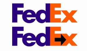
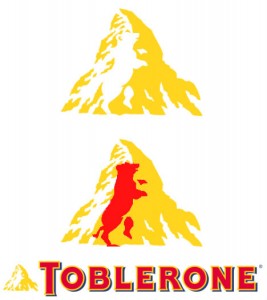
Look closely at the FedEx logo shown below. Notice the space between the ‘e’ and the ‘x’ and you’ll find that it looks like an arrow which represents the company’s speed, accuracy and direction. Some companies such as Facebook (the white ‘f’ in the blue tile) and Whatsapp (the call symbol in the green speech bubble) have designed entire logos around negative space. Be it the ‘1’ hidden in the F1 logo or the white bear concealed in the logo of Toblerone, correct utilisation of negative space can make a simple logo look extremely catchy.
IMAGE COURTESY- Super-cars Club, Web Urbanist
7. Use Online Resources
If you’re reading this, you already know about the Internet and its wonders. Make use of websites such as 99designs which has a Logo Store through which unique, personalized logos can be bought to suit the smallest of budgets. The site also lets clients create polls which are open to the public to choose between loads of logo submissions. There are sites like Logomaker and LogoYes for those who prefer to design on their own. The interfaces are user-friendly and more importantly, free.
Logos are to a brand what a painting is to an artist and a good logo will serve the same purpose as a good painting—it will awe, amaze and attract onlookers. For a small image to accomplish all that is nothing short of miraculous but that’s the wonder of logo design for you. Whether you choose a font or an illustration for your brand emblem, remember to have fun and stay creative. Happy designing!


