So what do you do when you have to explain a concept, or supply tons of information in the easiest and most user friendly form which is not only interesting, but to the point and clear as well?
Imagine you get the task of teaching this one big boring biology chapter to school students and you get the brief “Make it interesting”. Seems to be an impossible task doesn’t it? Well, we have an answer for you!
(Drum roll please) Infographics!
So what exactly are Infographics?
Infographics are simply using graphic design to visualize content that has long existed in other forms. While not appropriate or useful for all types of content, infographics can add valuable context to existing stories by using visuals to show relationships in data, anatomy, hierarchy, chronology, and geography. Infographics express complex messages to viewers in a way that enhances their comprehension. Images are often an extension of the content of a written article, but infographics convey a self-contained message or principle. The written word simply does not afford us immediate clarity in these areas, but put the key points along with relevant pictures, and voila! You’ll have those students acing the exam in no time! (hopefully)

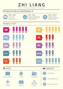
Singapore-based student Chen Zhi Liang created an infographic résumé showcasing all important qualifications and skills. Liang’s minimal approach is perfect to be eye-catching in an overcrowded job market .
.
Infographics have been used throughout history. The first known examples of infographics are hieroglyphics or cave paintings in ancient Egypt 5,000 years ago. Nicole d’Orseme (1352-82), Bishop of Lisieux, combined figures into groups and graphed them. Leonardo da Vinci combined graphics with text in his “Treatise on Painting.”
The Commercial and Political Atlas, published in 1786 by William Playfair, was the first example of modern infographics. Early adapters of infographics in the US include Fortune magazine, the Chicago Tribune and the New York Times.
How do we make Infographics?
Every picture tells a story, as they say, but sometimes it takes a clever combination of words and pictures to tell a story quickly, concisely and in an entertaining fashion.
“Infographics should be simple, clean, concise and clear. Make sure the information being conveyed is well organized. Visual simplicity ensures that the graphic will be easy for readers to comprehend.”
Of course the easiest way to explain how to make an infographic would obviously be through one, but you’d still need a little run through before the real deal. Below are the simple little steps you’d need to keep in mind while making a infographic;
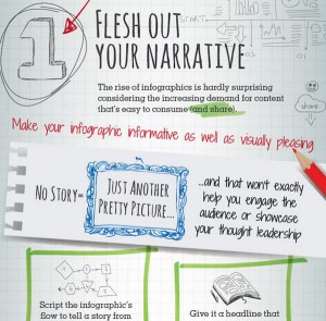
1. Write out a story.
All you really have to do is make a brief of what you want to say, get to the essence of the entire thing, find data and insights and then sum it up in the tiniest nutshell you can imagine. It’s just like note making – condensing an entire paragraph into one simple sentence.
2. Create your layout and visuals
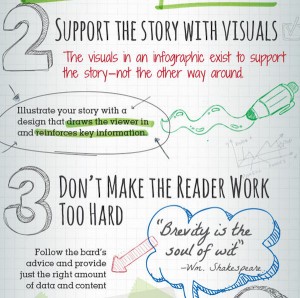
Next, you chose your visual analogy and create a layout. Add to that your visual elements, remember – the visuals are there to support the story, not the other way around, so illustrate with a design that draws the viewers in and reinforces the key information.
3. Make it simple.
Remember, it’s always advisable to ensure that your infographics are easy to read and understand. Ensure you don’t bombard the viewer with pictures and bright colors that draw attention from the point at hand!

If you’re confused about what your back story, secret identity and the colour of your spandex should be, this adorable infographic from Canadian illustrator Zia Somjee is your guide to saving the world.
So go on, pickup your pen and paper, plan it out, and design your own infographics, now!


