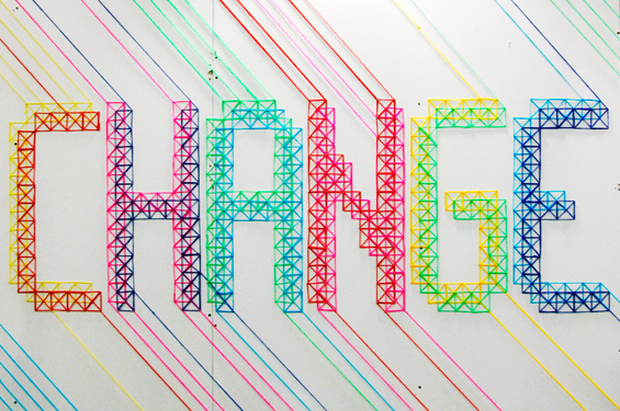
Words hold in them a power so great that can sway crowds and ignite ferocious wars or even end relationships forever. Written words are in themselves a miracle, putting into print sounds and noises that leave our throats and tongues. Typography is a type of craft to make these written words more aesthetically pleasing by manipulating their style, arrangement and overall appearance. Typographers are those creative beings who use the art of typography to put words in a more attractive and tasteful manner and adding on to the power they already possess.
Today at TYS, we bring to you 5 such typography artists whose type will leave you gazing in amazement and wanting for more!
Maricor & Maricar will STITCH you BRIGHT
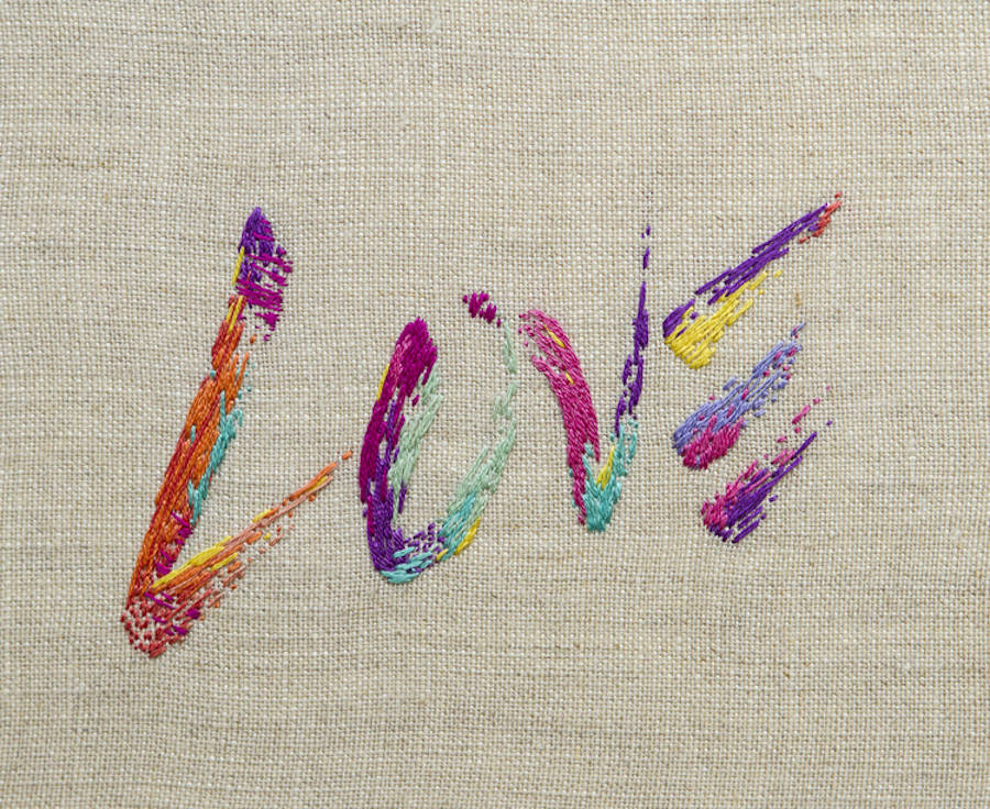
Maricor and Maricar are a twin sister duo based in Sydney who design and hand-stitch bold typography. Their type is usually vividly coloured quotes and phrases. Working as a team, they come up with unexpected colour combinations thus creating bright and fresh designs. They also often take inspiration from other designers and add their unique touch to it. Type such as ‘Love’, ‘You gotta keep cheering’, ‘Not everybody’s cup of tea’ and ‘Shut up I’m dreaming’ are playfully displayed on monochromatic backgrounds.
Their embroidery making process starts off with a sketch. With the help of digitalization or the use of watercolors they fill the typos with vibrant gradient schemes. The design is usually traced onto cotton or linen based fabrics before the needle work, rendering a tactile 3D effect.
Image Courtesy: Fubiz
mydeadpony’s DARK BUT COLOURFUL world
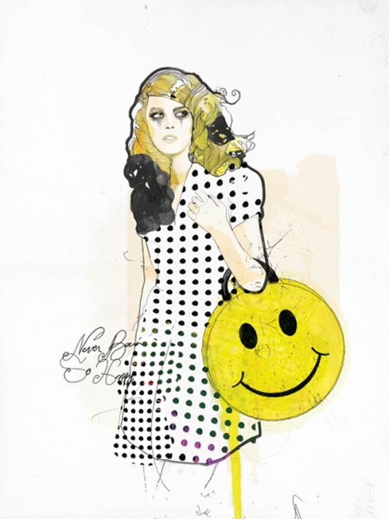
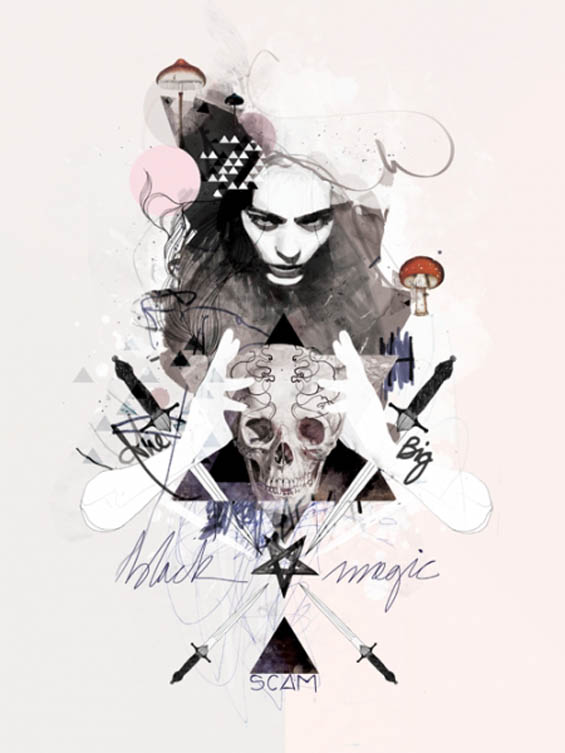
Raphaël Vicenzi is an illustrator also known as Mydeadpony, who combines the art of typography in his illustrations to create wonders that speak to us with a familiar melancholy, as they explore the underlying nature of our emotional lives; beneath every face is an interplay of longing, pain, desire, anticipation, and nostalgia. He creates stunning and ethereal portraits whose characters are a fascinating blend of darkness and light and yet also incorporating pastel colours. His type has a certain goth feel to it which is somehow pleasing and eclectic to the eyes and he says that his art is:
A constant struggle, battling with myself about this or that decision.
Image Courtesy: Mydeadpony
(NOT) DOWN THE DRAIN with Monique Goossens
Amsterdam-based Monique Goossens is a designer who creates typography from hair left behind in garbage, shower drain and combs thus incorporating both design and organic elements. Her idea is unique in her field which may seem a bit bizarre and disturbing.
The basic shape of the letters is created by forming the hundreds of hairs into a legible character and gives the impression of being fine pen drawings during which process Goosens follows the natural characteristics of the hairs: curly, rounded corners, springiness. The ends of the hairs create an organized chaos, an energetic play of lines which forms a haze around the letter’s basic shape.
Image Courtesy: Monique Goossens
TYPE AND TECHNOLOGY From Evelin Kasikov
A seamless combination of craft and design is the result of London-based typographer Evelin Kasikov’s work.
Using the technology of tactile and CMYK color, she operates with an analytical approach. Putting into use her well-developed typographic skill set, grid systems, design techniques she creates work which is graphically rich, and brings an element of handwork back into the graphic design process—something that adds a layer of complexity and humanity to work that would otherwise be purely computer-generated.
Image Courtesy: Evelin Kasikov
Lisa Rienermann’s TYPE IS THE SKY
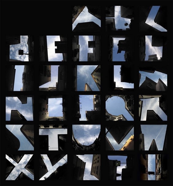
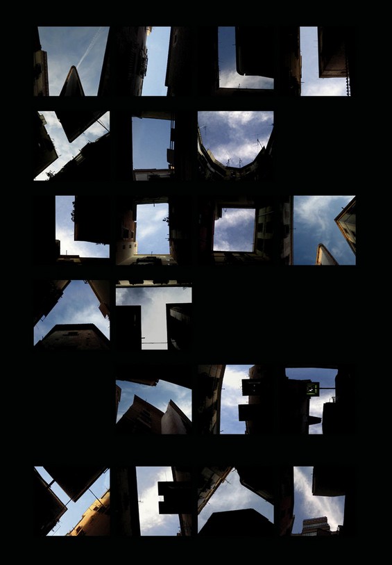
Lisa Rienermann’s sky typography series called ‘Type the Sky’ is one of my personal favourites. Considerably popular, it was also used by Mercedes and Renault for their respective advertising campaigns.
This type squeezes the New York sky between the tall buildings and establishments with clouds peeking from between, to create the English alphabet. Bringing with it a bit of tangled feel, the simplicity of the type and in the use of the sky and clouds is in a way soothing and utterly pleasing.
Image Courtesy: Lisa Rienermann
We hope these intriguing and stunning types by talented typographers were a treat for your eyes, and woke the typographer in you to express your words in a more aesthetically pleasing way too!

