People often confuse simplicity with lack of creativity or innovation. The phrase ‘less is more’ has debatably become synonymous with settling for what you have due to lack of opportunity. The concept of minimal design negates the above assumptions by emphasizing the beauty contained in simplicity.
Minimalism involves breaking down the design to its core essentials so as to accentuate the purpose behind the design. It strips away the unnecessary elements, making the main aim of the design the hero that indelibly catches every viewer’s eye.
The concept has succeeded in becoming the trend of the 20th and 21st centuries.Used by companies like Apple and favoured by designers all over the world, minimalism gives you a strong, to the point and uncluttered design that is bound to leave your audience enthralled.
Here are some tips on practicing the art of minimalist design:
1. Choose A Hero
The first and foremost rule to be followed is deciding the main attraction of the design. Be it a web site, an interior decoration project or even fashion, too much together diverges the focus of the viewer making the design the jack of all trades, but the master of none. Like a movie can’t have too many protagonists, similarly the design should focus on one key aspect that reflects its purpose.
Photo Courtesy – www.wallpaperscraft.com
2. Restrain The Hoarder In You
There are so many scintillating ideas and innovations out there that over-designing becomes a nocuous problem. Instead of over-burdening the design with too many facets, pick the one you like the best and roll with it. Moreover, don’t be afraid to give the design some breathing room. Every molecule of the page doesn’t need to be filled. Make the vacuum cleaner that helps you unclutter your conception your best friend!
Photo Courtesy – www.designschool.canva.com
3. Bold, Strong and Firm
Unique, bold and strong designs whether in color, typography, theme or graphics give a sense of purpose to the overall design. They scream clarity, objectivity and a firm sense of strategic and directional know how. Be very careful while choosing these as they can make or break your composition. Pick something that is not only compatible with your central piece but which also highlight’s it elegantly.
Photo Courtesy – www.designschool.canva.com
4. Consistency Is The Holy Grail
A little OCD while designing never hurts anyone. On the contrary it helps make the design clear, concise and recognizable. While designing your web page or working on an interior design, pick a theme and stick with it throughout. Think of it as the signature that identifies your project. One look at the design and people should know the artist or the company it belongs to.
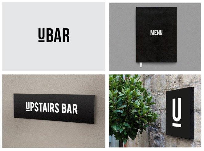 Photo Courtesy – www.designschool.canva.com
5. Where Rainbow’s End
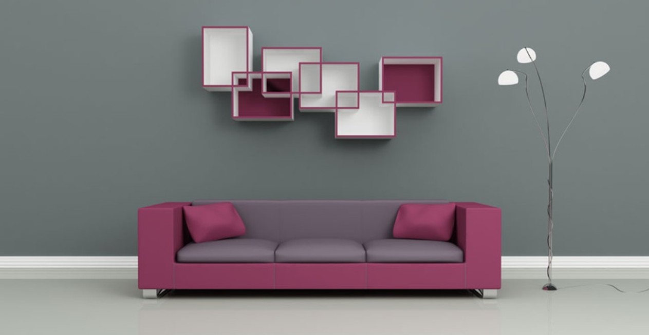
Putting too much color in the design has the potential to mask the content and the main aim of the project. It can visually hamper the viewer and take away their focus from the target. Single or dual color schemes which complement your design and accentuate the intention by perfectly blending in the background, are what you should be gunning for. Most minimalists use white or light colors to do the same, however that is not a hard and fast rule. After all there’s a reason that the bridesmaids usually get the unsavory dresses!
Photo Courtesy – www.download3dhouse.com
6. Alignment And Synergy
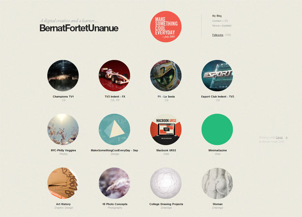
Again, having a little OCD regarding the alignment of various facets of the design will do you good. Symmetry makes the design clean, clear and appealing to the eye. Even if one element is an inch out of place, it will likely stick out like a sore thumb to the viewers.It is also essential to maintain perfect compatibility and synergy between the various aspects. The font, color scheme, graphics, content or the different pieces of furniture in the room should come together like the pieces of a puzzle.
Photo Courtesy – www.bernatfortet.com
7. A Balancing Act
The art of perfecting minimalism depends as much on simplicity as it does on balance. There’s a very fine line between too much and just enough. Weigh your elements carefully to construct an indestructible equilibrium between the same. No facet should over power or under power the others. To achieve flawless minimalism, you have to walk right on that line.
Photo Courtesy – www.designschool.canva.com
8. The Road Less Traveled
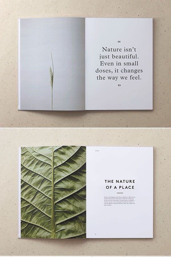
While engaging in minimalism, designers often assume that flat, single colors are the only option available. This, however is far from the truth. All the design needs is a singular, bold and complementary theme. Now whether you choose to experiment with texture, pictures or print depends completely on your creativity and ambition. Don’t restrict yourself to arbitrary norms, thinking outside the box is never a bad thing.
Photo Courtesy – www.designschool.canva.com
9. Be Direct
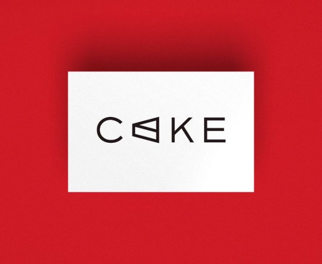
All beating around the bush does is frustrate and irritate the audience. A key feature of minimal design is clear cut and defining directness that elucidates your intention in a short, crisp and concise manner. This technique should specifically be followed in content development on sites. The first thing that the viewer should be greeted with is the purpose of the site in bold and crystal clear letters.
Photo Courtesy – www.onepagelove.com
10. Sophie’s Choice
In minimalism you have the power to go big or small depending on the need of the design. It’s a forked road where you can choose to scale up the main objective so as to grasp the attention of the viewer or you can get creative and make small adjustments to your inherently simple site or logo so as to keep it humble but aesthetically appealing at the same time.


