After reading our previous article about some of the most creative book covers and the stories behind each of them, you’d be convinced that you can judge a book by its cover. These book cover designs we talked are so innovative that you would probably be enticed to buy them without reading the summary on the back cover (and that’s really saying something).
Because honestly, if covers don’t matter, why are book cover artists appointed by writers? They can simply write the name of their book on the cover and that could be it! Book cover designs do have an impact on the marketing of a particular book. One can weave all the words that could ever exist in the human lexicon to make them strike a chord with you in the book, but if the cover reflects a failed attempt to use Adobe, then no one is ever going to pick that book up.
As you must have noticed by now, creativity is all it takes to add that extra oomph factor to turn a mediocre book cover into a fabulous one. Having said that, we here at TYS couldn’t get enough of creative book cover designs that have been published through the years (I mean, books and creativity together? We’re sold.) – and it seems that neither could you!
So we went ahead and did it – another article on most creative cover designs that will urge you to pick them up without a second thought! Let’s get started!
1. Something for the Pain
Paul Austin
Through this cover, Helen Yentus has very strategically delivered the setting of the book – a hospital. The white boxes mimic the aseptic environment of the hospitals and a white box covering the face of the doctor creates anonymity on the part of the doctor making it more relatable to the readers!
Picture Credits: Canva
2. Devil In The Details
Jennifer Traig
This is the impact that carefully designed covers have! Revolving around obsessive-compulsive disorder, this cover, with perfectly aligned rows and columns of beads is just a perfect fit for the novel! Kelly Blair has really done justice to the novel by designing a cover with such colors and concept.
Picture Credits: Canva
3. The Boy Who Couldn’t Sleep And Never Had To
DC Pierson
This cover by Helen Yentus is simply a combination of several hand-drawn images on the loose leaflets that make it pop-off the screen. In relation with the title, one can get an insight of what the novel would be like as the images are not the ones that a skilled adult would draw. These hint the reason behind the title of the novel!
Picture Credits: Pinterest
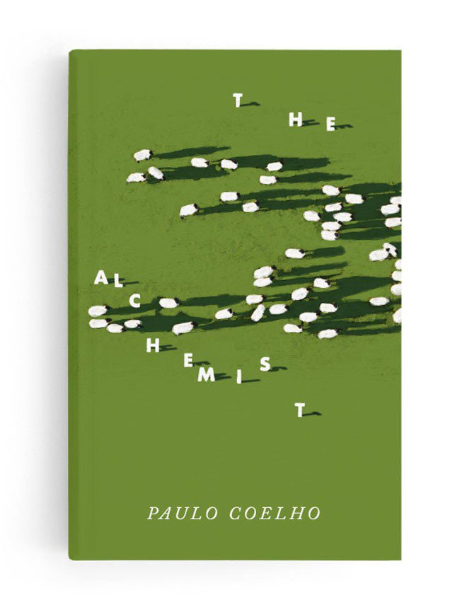
4. The Alchemist
Paulo Coelho
This cover was designed months after the book was released by Jenny Volvovski. The carefully random-looking placement of these texts and elements represent the imagery of scattered sheep in the field which very creatively represents the theme of the novel. It’s just amazing in the way it represents people who are uncertain about following their dreams.
Picture Credits: Canva
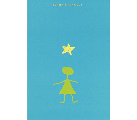
5. Star Girl
Jerry Spinelli
This is what minimalist cover designs do- they express so much by exhibiting so less! The cover does not include the title of the book as the image of the girl and the star above it says it all! The best part is that the creation of this cover is a result of the creativity of the writer of this book!
Picture Credits: 1st Web Designer
6. Little Spines
By Students at RMIT University
Written by creative minds, this cover by Vibeke Illevold, does justice to the flavor of its content, i.e the anthology of creative writing . Through the cover, one can decipher that it’s the different stages of life that is being talked about. A commendable creation, we think!
Picture Credits: The Book Deisgn Blog
7. Killing The Buddha
Peter Manseau
Designed by Paul Sahre, this book cover won the runner up for top book cover design award in 2004. Unlike cliché book covers, it has no title, subtitle or author’s name. Just a cross on the clouds that brings no hint but just confusion and thus, catching the attention of all the people looking at it!
Picture Credits: Simon And Chuster
8. Area X
Jeff Vander Meer
Designed by Rodrigo Corral and Tyler Comrie, the juxtaposition of the stick and the leaves provides a very confusing yet appealing look to the book. With no hint through the beautiful cover, this cover is really eloquent of the out-of-the-box content inside.
Picture Credits: Canva
These amazingly creative book cover designs do not leave any space for an afterthought. They’re attractive, insightful and speak about the soul of their respective books!


